My friend wanted a film promo poster made up for his next film called 'The Profesional' (Yes it is meant to be one s).
The Work of Sam Blackie
Saturday 27 April 2013
Wednesday 27 February 2013
Chillwave Website Design
For this project I had to create a website with a fanzine feel to it...a screenzine. I chose the unofficial music genre 'Chillwave'.
Above is the loading page for the homepage. The screen on the left half shows the page only loaded to about 25% and the right side being 75%. As the page loads the sun rises. The same design is on the phone, just smaller. The music player has been condensed down to just the play/pause and volume buttons, with a drop arrow to make it bigger.
This is the homepage fully loaded. As you can see there are green lights that move across the sea. When the user hovers over each a different message will appear introducing the website. On the phone application the dots will not move.
Above is the Articles page. The background is actually ink moving around slowly in purple coloured water. The jelly fish swim around at the same pace and when they are clicked on the swim towards the screen and open up the article, as seen above. The same process applies on the phone app.
This is the gallery page. The page background is a puddle of water with rain drops falling into it. The images float half in the water and when one is clicked on it expands, as seen above. The phone version will just show a grid type gallery and when an image is clicked on it shows the page above.
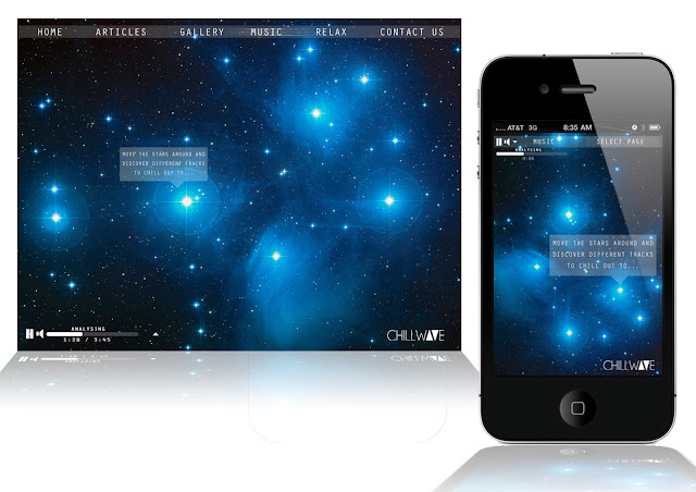
The page above is an application to discover different variations of Chillwave. The page tells the user to move about the stars to discover different tracks. The process behind this is that it is a grid system whereby each corner on screen represents a value for Bass/Vocals/Treble/Tempo. The number of stars in one corner will determine the value for that element, which will select a song relevant to the values. The same process applies on the phone version.
The page above is the 'Relax' page. It lets the user input information which will then create a playlist for them to listen to. An example of the information they give could be that; they are studying, for 30 minutes, and they want a slow tempo. The same applies on the mobile version.
Friday 22 February 2013
ALTCULTURE Logo
I was asked to design a simple logo for a music blog. I wanted to keep the logo as simple as possible, whilst letting the audience know that the blog would be about music.
Friday 1 February 2013
Robert Brownjohn Branding
I was given the designer Robert Brownjohn to turn him into a brand and product. I decided to make his logo in the shape of an erotic woman because of his love for sexual graphics and because of his work on the James Bond title sequences. The reason for creating a stimulation drink was because of the buzz his life gave off from the drugs and alcohol he dealt with for the majority of his life. I wanted the design to look professional and stylish not only so that it appealed to an older audience but also because of sophisticated images I have seen of him.
Monday 28 January 2013
Packaging Sketches
A few sketches of packaging for everyday food and drink items using charcoal pencils and a white pencil. This is in preparation for designing our own packaging for our design hero.
Canvas Portrait
I created this canvas for someone who wanted to give a gift to a relative. The background was painted using acrylics with the stencil being sprayed on with gloss paint.
Saturday 22 December 2012
Stencil of Children Artwork
This is a piece of work I created for someone who wanted a stencil image of their daughters. The background is painted using acrylics and then the stencil is gloss spray paint.
Subscribe to:
Posts (Atom)


